| | Original Poster Concepts for LTK |  |
|
|
| Author | Message |
|---|
Mr. Kiss Kiss Bang Bang
00 Agent


Posts : 8500
Member Since : 2010-05-12
Location : Strawberry Fields
 | |
  | |
Blunt Instrument
00 Agent


Posts : 6402
Member Since : 2011-03-20
Location : Propping up the bar
 |  Subject: Re: Original Poster Concepts for LTK Subject: Re: Original Poster Concepts for LTK  Tue Jun 11, 2019 10:10 am Tue Jun 11, 2019 10:10 am | |
| I'm thinking you put Soto somewhere in the second one (the iguana making for an oblique reference to her being Sanchez's 'kept woman') and Lowell somewhere in the third, what with the help Pam gives Bond during the truck chase. |
|
  | |
CJB
00 Agent


Posts : 5542
Member Since : 2011-03-14
Location : 'Straya
 |  Subject: Re: Original Poster Concepts for LTK Subject: Re: Original Poster Concepts for LTK  Tue Jun 11, 2019 1:11 pm Tue Jun 11, 2019 1:11 pm | |
| The first one is deliciously 80's. You can practically hear the Mangum PI opening title track.
The iguana on the handgun is the winner though. Wouldn't be out of place on one of the Jonathan Cape covers. |
|
  | |
Mr. Kiss Kiss Bang Bang
00 Agent


Posts : 8500
Member Since : 2010-05-12
Location : Strawberry Fields
 |  Subject: Re: Original Poster Concepts for LTK Subject: Re: Original Poster Concepts for LTK  Tue Jun 11, 2019 1:32 pm Tue Jun 11, 2019 1:32 pm | |
| - Blunt Instrument wrote:
- I'm thinking you put Soto somewhere in the second one (the iguana making for an oblique reference to her being Sanchez's 'kept woman') and Lowell somewhere in the third, what with the help Pam gives Bond during the truck chase.
Indeed it seems a case of either/or when adding a Bond girl into the mix. - CJB wrote:
- The iguana on the handgun is the winner though.
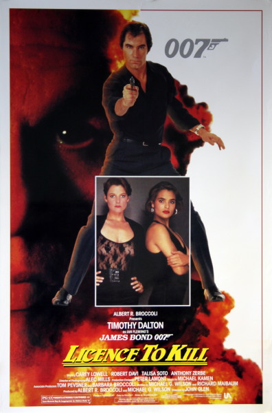
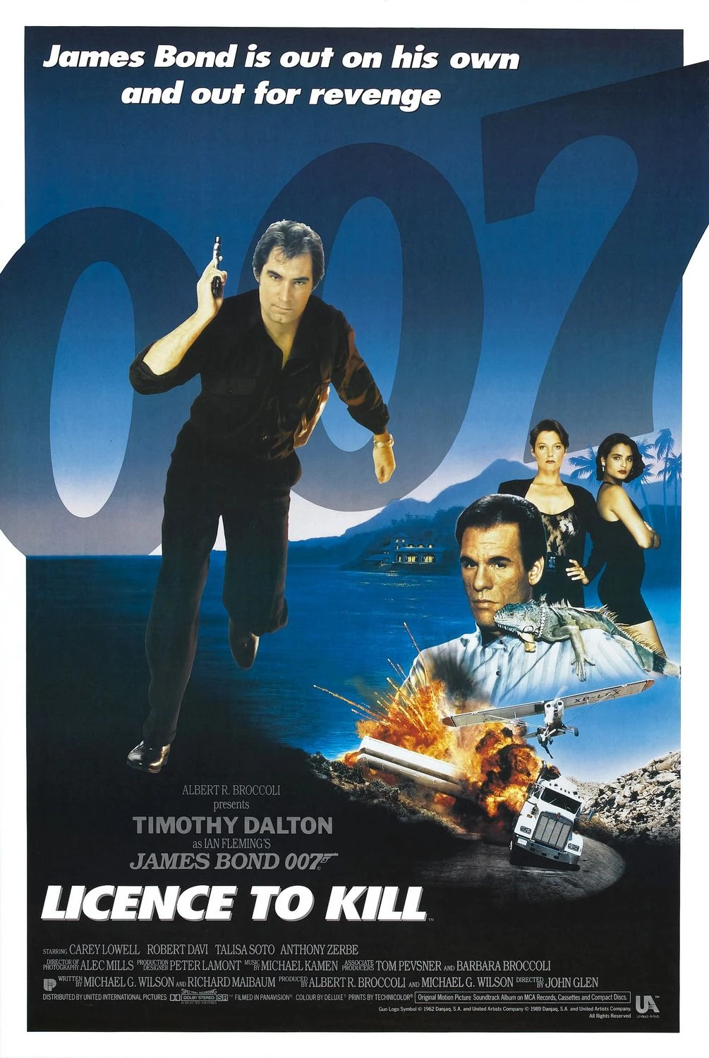
Agreed. Why that wasn't the poster instead of this hack job is beyond me:  |
|
  | |
Blunt Instrument
00 Agent


Posts : 6402
Member Since : 2011-03-20
Location : Propping up the bar
 |  Subject: Re: Original Poster Concepts for LTK Subject: Re: Original Poster Concepts for LTK  Tue Jun 11, 2019 2:43 pm Tue Jun 11, 2019 2:43 pm | |
| The expanse of empty white space down one side and the looks-like-it-was-added-as-an-afterthought pic of the actresses are competing to be the worst things about that poster. The teaser one's fairly decent -  The other 'main' one is pretty uninspired -  |
|
  | |
Mr. Kiss Kiss Bang Bang
00 Agent


Posts : 8500
Member Since : 2010-05-12
Location : Strawberry Fields
 |  Subject: Re: Original Poster Concepts for LTK Subject: Re: Original Poster Concepts for LTK  Wed Jun 12, 2019 12:36 am Wed Jun 12, 2019 12:36 am | |
| - Blunt Instrument wrote:
- The expanse of empty white space down one side and the looks-like-it-was-added-as-an-afterthought pic of the actresses are competing to be the worst things about that poster.
Yeah, I like that there's a split, but don't leave it blank. The girls could have easily been worked in there instead of pasting a separate photo on Dalton. - Quote :
- The teaser one's fairly decent -
 Yeah. But after seeing the much sleeker iguana poster... - Quote :
- The other 'main' one is pretty uninspired -

Yeah nothing sensational but I do like a little bit of effort went into that one.  |
|
  | |
Hilly
Administrator


Posts : 8077
Member Since : 2010-05-13
Location : Chez Hilly, the Cote d'Hampshire
 |  Subject: Re: Original Poster Concepts for LTK Subject: Re: Original Poster Concepts for LTK  Wed Jun 12, 2019 7:35 pm Wed Jun 12, 2019 7:35 pm | |
| that first one with the "dangerous place" tagline is the cover for the novelisation. Not as bad as it could've been. Shame LTK wasn't done now, I'd imagine we'd get some fairly cracking ones. |
|
  | |
hegottheboot
Head of Station


Posts : 1758
Member Since : 2012-01-08
Location : TN, USA
 |  Subject: Re: Original Poster Concepts for LTK Subject: Re: Original Poster Concepts for LTK  Thu Jun 13, 2019 4:18 am Thu Jun 13, 2019 4:18 am | |
| This is all due to the studio destroying the ad campaign with bland WTFness and throwing out the intended campaign which I believe the concepts were part of. It's mentioned in the commentary. |
|
  | |
Mr. Kiss Kiss Bang Bang
00 Agent


Posts : 8500
Member Since : 2010-05-12
Location : Strawberry Fields
 |  Subject: Re: Original Poster Concepts for LTK Subject: Re: Original Poster Concepts for LTK  Thu Jun 13, 2019 4:23 am Thu Jun 13, 2019 4:23 am | |
| Why did they destroy the ad campaign? Haven't watched the commentary in years. |
|
  | |
Blunt Instrument
00 Agent


Posts : 6402
Member Since : 2011-03-20
Location : Propping up the bar
 |  Subject: Re: Original Poster Concepts for LTK Subject: Re: Original Poster Concepts for LTK  Thu Jun 13, 2019 11:33 am Thu Jun 13, 2019 11:33 am | |
| Wonder was there any thinking behind the Walther being gold on the teaser other than it needs to stand out against a black background? |
|
  | |
Mr. Kiss Kiss Bang Bang
00 Agent


Posts : 8500
Member Since : 2010-05-12
Location : Strawberry Fields
 |  Subject: Re: Original Poster Concepts for LTK Subject: Re: Original Poster Concepts for LTK  Thu Jun 13, 2019 1:11 pm Thu Jun 13, 2019 1:11 pm | |
| Is it supposed to be gold? Just thought it was the lighting. |
|
  | |
Blunt Instrument
00 Agent


Posts : 6402
Member Since : 2011-03-20
Location : Propping up the bar
 |  Subject: Re: Original Poster Concepts for LTK Subject: Re: Original Poster Concepts for LTK  Thu Jun 13, 2019 3:36 pm Thu Jun 13, 2019 3:36 pm | |
| |
|
  | |
hegottheboot
Head of Station


Posts : 1758
Member Since : 2012-01-08
Location : TN, USA
 |  Subject: Re: Original Poster Concepts for LTK Subject: Re: Original Poster Concepts for LTK  Mon Jun 17, 2019 3:57 am Mon Jun 17, 2019 3:57 am | |
| It's just the rendering of that particular photo. The poster itself has a silvery PPK.
I believe it was Jerry Juroe who was bemoaning the fact they had planned a really nice campaign and then suddenly the powers that be at MGMUA decided on some hotshot ad agency who worked in the popular ways of the time to make what we wound up with. |
|
  | |
Mr. Kiss Kiss Bang Bang
00 Agent


Posts : 8500
Member Since : 2010-05-12
Location : Strawberry Fields
 |  Subject: Re: Original Poster Concepts for LTK Subject: Re: Original Poster Concepts for LTK  Mon Jun 17, 2019 6:38 am Mon Jun 17, 2019 6:38 am | |
| Slapping a photograph on top of the main characters legs was deemed a "popular way of the time?"  |
|
  | |
hegottheboot
Head of Station


Posts : 1758
Member Since : 2012-01-08
Location : TN, USA
 |  Subject: Re: Original Poster Concepts for LTK Subject: Re: Original Poster Concepts for LTK  Mon Jun 24, 2019 3:36 am Mon Jun 24, 2019 3:36 am | |
| You got me. I have no earthly idea what the heck that campaign is supposed to be. Sanchez in red as the background is nice and had they used a more dapper shot of Dalton without the slapped on photo box between the legs it would look far better. But the international art despite being more traditional is far worse due to it being so slapped together and just lazy. Despite being simple and reusing the TLD promo image this is still my favorite cover for LTK:  I still adore this run of art and UK/Europe got some interesting alternates. |
|
  | |
Sponsored content
 |  Subject: Re: Original Poster Concepts for LTK Subject: Re: Original Poster Concepts for LTK  | |
| |
|
  | |
| | Original Poster Concepts for LTK |  |
|
