| | How this site should look, etc. |  |
|
+10Moore retrokitty Largo's Shark Fort Knox The White Tuxedo Mr. Kiss Kiss Bang Bang Makeshift Python Control colly Lazenby. 14 posters |
|
| Author | Message |
|---|
Lazenby.
Head of Station

Posts : 1274
Member Since : 2010-04-15
Location : 1969
| | Subject: How this site should look, etc. Mon Mar 14, 2011 6:30 am | |
| I've just sent an e-mail to the mod of the site, with the news that this place will hopefully be back on track, so hopefully we can have any alterations sorted out if necessary.
If anyone has any suggestions as to improvements that could be made here such as ease of use, layout etc, maybe we can post any ideas here. This place can be as good as we choose to make it. I'd guess that mods will be needed as well if the place takes off, so hopefully quite a few of the best MI6ers can contribute big-time to this place.
Anyway... ideas, if any?
|
|
| | |
colly
Q Branch


Posts : 782
Member Since : 2011-03-14
Location : Frozen in time
| | Subject: Re: How this site should look, etc. Mon Mar 14, 2011 6:34 am | |
| I might be missing it - but there doesnt seem to be a "new posts" button when you're looking in a thread. |
|
| | |
Lazenby.
Head of Station
Posts : 1274
Member Since : 2010-04-15
Location : 1969
| | Subject: Re: How this site should look, etc. Mon Mar 14, 2011 6:45 am | |
| I just click on "View posts since last visit" in the top right hand corner on the front page, it brings up all of the latest posts. |
|
| | |
Control
00 Agent


Posts : 5206
Member Since : 2010-05-13
Location : Slumber, Inc.
| | Subject: Re: How this site should look, etc. Mon Mar 14, 2011 7:32 am | |
| I'll offer a few comments on this matter...
- Perhaps the owner could decrease the height of the top banner. In my opinion, it seems a bit too large for the forum.
- Change the forum background to black, or a steel grey.
- Continue to permit free speech. Swearing here and there really doesn't kill people. As long as we're keeping it on a respectful level, then I think it's fine. Same goes for the casual jokes. |
|
| | |
colly
Q Branch
Posts : 782
Member Since : 2011-03-14
Location : Frozen in time
| | Subject: Re: How this site should look, etc. Mon Mar 14, 2011 7:43 am | |
| - colly wrote:
- I might be missing it - but there doesnt seem to be a "new posts" button when you're looking in a thread.
To clear up... by clicking on that "actions!" button - you can access it when not on the homepage. 8) |
|
| | |
Lazenby.
Head of Station
Posts : 1274
Member Since : 2010-04-15
Location : 1969
| | Subject: Re: How this site should look, etc. Mon Mar 14, 2011 7:47 am | |
| - colly wrote:
- colly wrote:
- I might be missing it - but there doesnt seem to be a "new posts" button when you're looking in a thread.
To clear up... by clicking on that "actions!" button - you can access it when not on the homepage. 8) Nice find Colly, cheers. 8) - Mr. Brown wrote:
- I'll offer a few comments on this matter...
- Perhaps the owner could decrease the height of the top banner. In my opinion, it seems a bit too large for the forum.
- Change the forum background to black, or a steel grey.
- Continue to permit free speech. Swearing here and there really doesn't kill people. As long as we're keeping it on a respectful level, then I think it's fine. Same goes for the casual jokes. I'll second that. As for the banner, we should nick this just to p*** them off:  Besides, it's not like they'll be needing it anymore. |
|
| | |
Makeshift Python
00 Agent

Posts : 7656
Member Since : 2011-03-14
Location : You're the man now, dog!
| | Subject: Re: How this site should look, etc. Mon Mar 14, 2011 8:30 am | |
| No, let's not put the KTBEU banner up.
That site is long dead. We can only carry its spirit. Let's leave it in peace and embrace BOND AND BEYOND! She would have wanted it that way.
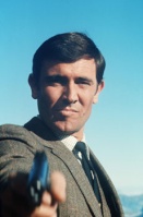
But I do agree that the banner should be resized. And somebody PLEASE replace NSNA Connery with Connery in his prime 1960s/EON era. |
|
| | |
Mr. Kiss Kiss Bang Bang
00 Agent

Posts : 8496
Member Since : 2010-05-12
Location : Strawberry Fields
| | Subject: Re: How this site should look, etc. Mon Mar 14, 2011 9:06 am | |
| I'm liking this site.
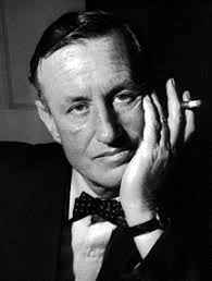
I agree with what Brown said, except that I like the background. Also, how about an image of Ian Fleming on the banner?
And the ads. Is there any way of getting rid of those ads? I really don't want to start trading Forex with eToro.... |
|
| | |
The White Tuxedo
00 Agent

Posts : 6062
Member Since : 2011-03-14
Location : ELdorado 5-9970
| | Subject: Re: How this site should look, etc. Mon Mar 14, 2011 10:46 am | |
| - Mr. Brown wrote:
- I'll offer a few comments on this matter...
- Perhaps the owner could decrease the height of the top banner. In my opinion, it seems a bit too large for the forum.
- Change the forum background to black, or a steel grey. I agree on the banner, but I like the rest of the look. I like the look of the actual areas where the text is. I don't want that to be black. God no, I don't want a CB.n look! |
|
| | |
Lazenby.
Head of Station
Posts : 1274
Member Since : 2010-04-15
Location : 1969
| | Subject: Re: How this site should look, etc. Mon Mar 14, 2011 10:53 am | |
| I assumed Brown meant for the borders to be black, instead of the Bond designs. I like the text area as it is too, FWIW. |
|
| | |
Mr. Kiss Kiss Bang Bang
00 Agent
Posts : 8496
Member Since : 2010-05-12
Location : Strawberry Fields
| | Subject: Re: How this site should look, etc. Mon Mar 14, 2011 12:11 pm | |
| - Lazenby. wrote:
- I just click on "View posts since last visit" in the top right hand corner on the front page, it brings up all of the latest posts.
Yes, but this is just for the posts in that section. So, if I was to click into this post, and then click onto "View posts since last visit" it'll just be posts within the Enquries section. It'd be easier if one could click onto View Your Posts from every page.... |
|
| | |
Control
00 Agent
Posts : 5206
Member Since : 2010-05-13
Location : Slumber, Inc.
| | Subject: Re: How this site should look, etc. Mon Mar 14, 2011 7:09 pm | |
| Also, I demand that Laz keeps his current avatar.  |
|
| | |
Fort Knox
Administrator


Posts : 608
Member Since : 2010-01-11
Location : that Web of Sin
| | Subject: Re: How this site should look, etc. Mon Mar 14, 2011 7:49 pm | |
| I've reduced the size of the top banner and made it a bit more simple, but it could still be a lot better. Any artists out there? We need a quality banner around the same size, kept within the colour scheme of the site if possible but something really classy. Also if anyone can suggest backgrounds if the James Bond logo isn't to everyone's liking then that would be great as well.
All suggestions very welcome. The site is what we make of it.
|
|
| | |
Largo's Shark
00 Agent
Posts : 10588
Member Since : 2011-03-14
| | Subject: Re: How this site should look, etc. Mon Mar 14, 2011 7:52 pm | |
| The 'view latest posts' or 'view previous posts' features should be much larger, and accessible while in-topic, at the top of the page. They were the two buttons I used the most back on the old MI6. |
|
| | |
Fort Knox
Administrator
Posts : 608
Member Since : 2010-01-11
Location : that Web of Sin
| | Subject: Re: How this site should look, etc. Mon Mar 14, 2011 8:07 pm | |
| - Sharky wrote:
- The 'view latest posts' or 'view previous posts' features should be much larger, and accessible while in-topic, at the top of the page. They were the two buttons I used the most back on the old MI6.
I'll look into that and change it if I can. I agree that it could do with being a bit clearer. |
|
| | |
The White Tuxedo
00 Agent
Posts : 6062
Member Since : 2011-03-14
Location : ELdorado 5-9970
| | Subject: Re: How this site should look, etc. Tue Mar 15, 2011 2:35 am | |
| Our tagline should be "All the cool kids are doing it." |
|
| | |
retrokitty
'R'

Posts : 498
Member Since : 2011-03-14
Location : Beautiful British Columbia
| | Subject: Re: How this site should look, etc. Tue Mar 15, 2011 2:53 am | |
| I do a bit of graphics and photoshop these days so I'd be happy to draft up a banner or two if anyone wants me to give it a try... |
|
| | |
The White Tuxedo
00 Agent
Posts : 6062
Member Since : 2011-03-14
Location : ELdorado 5-9970
| | Subject: Re: How this site should look, etc. Tue Mar 15, 2011 3:03 am | |
| It's too big, as I went from the old banner size, but...  I was gonna do a burnt orange text. What I think would be cool is a collection of banners this size...  One for each Bond, and they pop up at random. Maybe. I think something very understated would be best. Very simply font. Like ariel. Or whatever white font was used in the old title sequences. I don't want see a photoshop job of all six actors in one banner. I'll try to look for good images to base these on. I think they should be simple and black-and-white.
Last edited by The White Tuxedo on Tue Mar 15, 2011 3:05 am; edited 1 time in total |
|
| | |
Lazenby.
Head of Station
Posts : 1274
Member Since : 2010-04-15
Location : 1969
| | Subject: Re: How this site should look, etc. Tue Mar 15, 2011 3:04 am | |
| - retrokitty wrote:
- I do a bit of graphics and photoshop these days so I'd be happy to draft up a banner or two if anyone wants me to give it a try...
That would be brilliant Kitts. 8) |
|
| | |
The White Tuxedo
00 Agent
Posts : 6062
Member Since : 2011-03-14
Location : ELdorado 5-9970
| | Subject: Re: How this site should look, etc. Tue Mar 15, 2011 3:08 am | |
| Maybe in the "BEYOND."
The E and Y are silhouetted in circles, like the gunbarrel circles that go across the screen. And the O has a silhuolette of Bond in the gunbarrel.
Or not. |
|
| | |
retrokitty
'R'
Posts : 498
Member Since : 2011-03-14
Location : Beautiful British Columbia
| | Subject: Re: How this site should look, etc. Tue Mar 15, 2011 3:10 am | |
| Well, I always think it's great to brainstorm and draft and brainstorm again. I like simple... So put out your ideas and maybe through the week I'll give it some time and draft a few things out. With some of the programs I have at the office, once the text is chosen, I can alter existing fonts so that they are unique to just this site.
And I do like the way you are thinking with the ooohs.
|
|
| | |
The White Tuxedo
00 Agent
Posts : 6062
Member Since : 2011-03-14
Location : ELdorado 5-9970
| | Subject: Re: How this site should look, etc. Tue Mar 15, 2011 3:17 am | |
|  At least we've got that settled. |
|
| | |
Moore
Q Branch
Posts : 648
Member Since : 2011-03-14
| | Subject: Re: How this site should look, etc. Tue Mar 15, 2011 3:17 am | |
| |
|
| | |
colly
Q Branch
Posts : 782
Member Since : 2011-03-14
Location : Frozen in time
| | Subject: Re: How this site should look, etc. Tue Mar 15, 2011 3:26 am | |
| Here's a quick 'un: 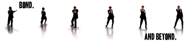 |
|
| | |
The White Tuxedo
00 Agent
Posts : 6062
Member Since : 2011-03-14
Location : ELdorado 5-9970
| | Subject: Re: How this site should look, etc. Tue Mar 15, 2011 3:29 am | |
| |
|
| | |
Sponsored content
| | Subject: Re: How this site should look, etc. | |
| |
|
| | |
| | How this site should look, etc. | |
|